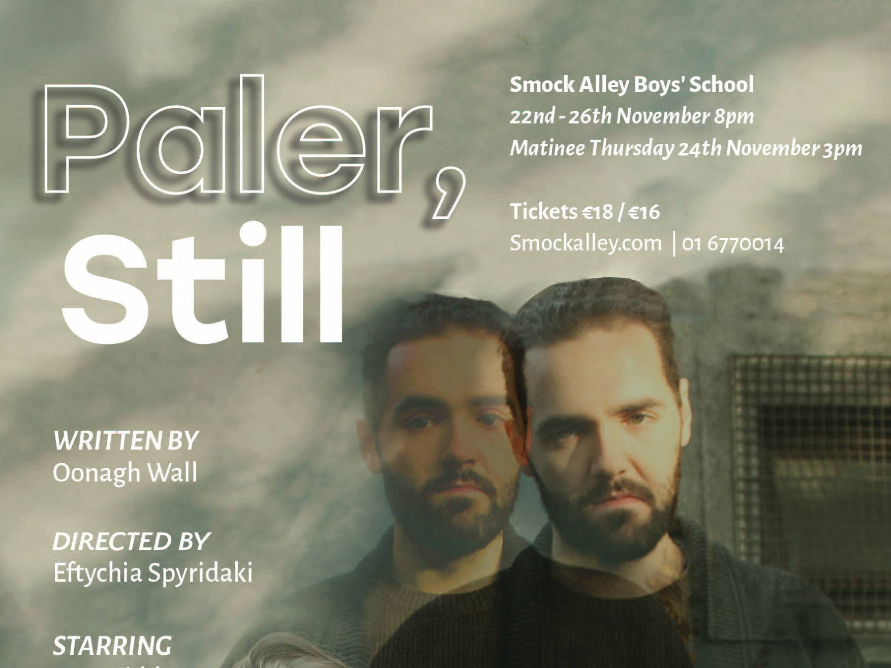
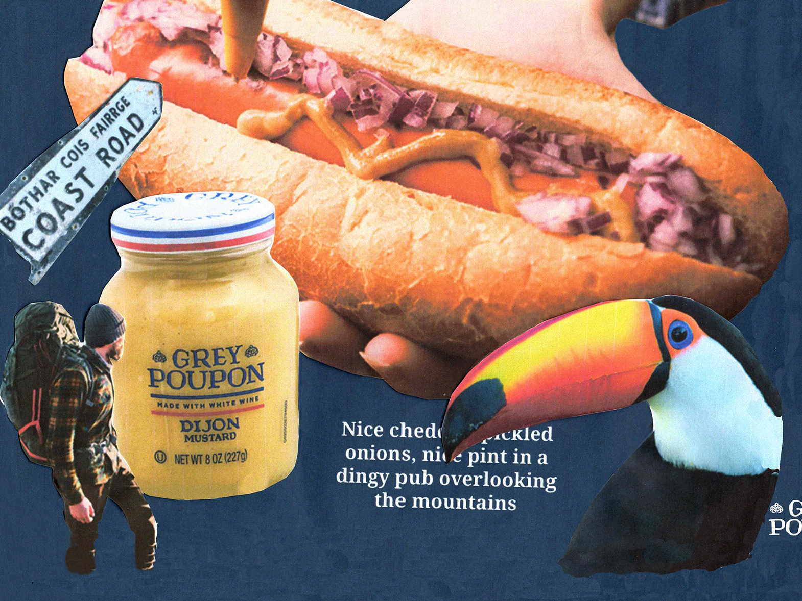
In envisioning this concept for casting director Áine O’Sullivan, the lead designer and I aimed to authentically capture her passion for the artists she works with and the screen industry at large. This was a collaboration between myself and Ste Murray at Ste.ie.
This project was recognised for outstanding design work in the 2023 '100 Archive'.
See below for my process.



THE PROCESS
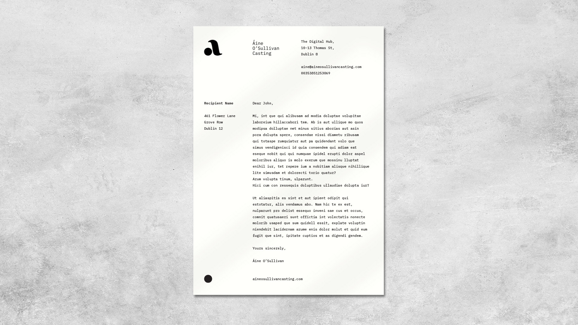
Similar to the branding for The Sundance Film Festival, we kept a clean, elegant and versatile approach to Áines branding to be seen and used for casting calls, business cards and presentations. In play and movie scripts, each page is historically type written in courier with each page containing 55 lines, equating to roughly 5 minutes of speech. Keeping this egalitarian approach, I decided to try an approach with a monospaced typeface. I used IBM Plex Mono for its neutrality and balance, the typeface paying homage to the tradition of script typesetting.
Áine has three initials, so I led an experiment with a logo mark incorporating the three letters.
These wordmark options sought to mirror Áine’s deep connection with scripts and the acting community. The quotation marks stem from the apostrophe and the fada, forming a deliberate link between Áine and her craft.
After refinement, I presented Áine with three concepts for her to mix and match ideas with. She took a liking to the play with the fada in concept 1 and the apostrophe, how I had combined them to make quotation marks as a direct reference to dialogue. She requested that the logo mark in concept 2 be softer and more legible and asked that I combine it with concept 1.
Moving forward with the logo, in D-H, the lead designer and I worked together to soften it to reflect her warm and approachable nature.
We developed a calm, confident and modern brand with a soft touch that aligned with Áine's sensibility and direction. The refined colour palette signifies an evolution, aiming to elevate the brand to a more sophisticated place while staying rooted in Áine’s personality.
